
I like Apple. Their hardware, which epitomizes modern design, is powerful and revolutionary. Their sleek software embodies a near-perfect user experience for a majority of their audience. When Apple revealed iOS 7, their latest mobile OS, I was very excited for the radical redesign. But after using the new operating system for just a couple of seconds, I discovered that Apple had made a huge mistake with their design of iOS 7: Navigation buttons – arguably one of the most important design elements of a touch-based interface – are completely borderless.
Borderless Buttons are Bad
You likely spend quite a bit of your day navigating throughout a virtual interface with your mouse or your finger. Perhaps you’re browsing the Web with Google Chrome on Windows, changing your theme on an Android device, or checking your email using Outlook on your laptop. No matter the program, the interface guides you to perform actions within the application via some sort of visual cue. For example, links on the Web may be a different color, underlined, and change your cursor to a pointer when you hover over them. Buttons on Android have some sort of obvious border. Buttons in Outlook glow when you hover over them, and “sink in” when you click them.
Many navigation buttons across iOS 7 consist of borderless text, and this is bad. Take a look at this graphic, entitled “iOS App Anatomy,” taken straight from Apple’s iOS Human Interface Guidelines:
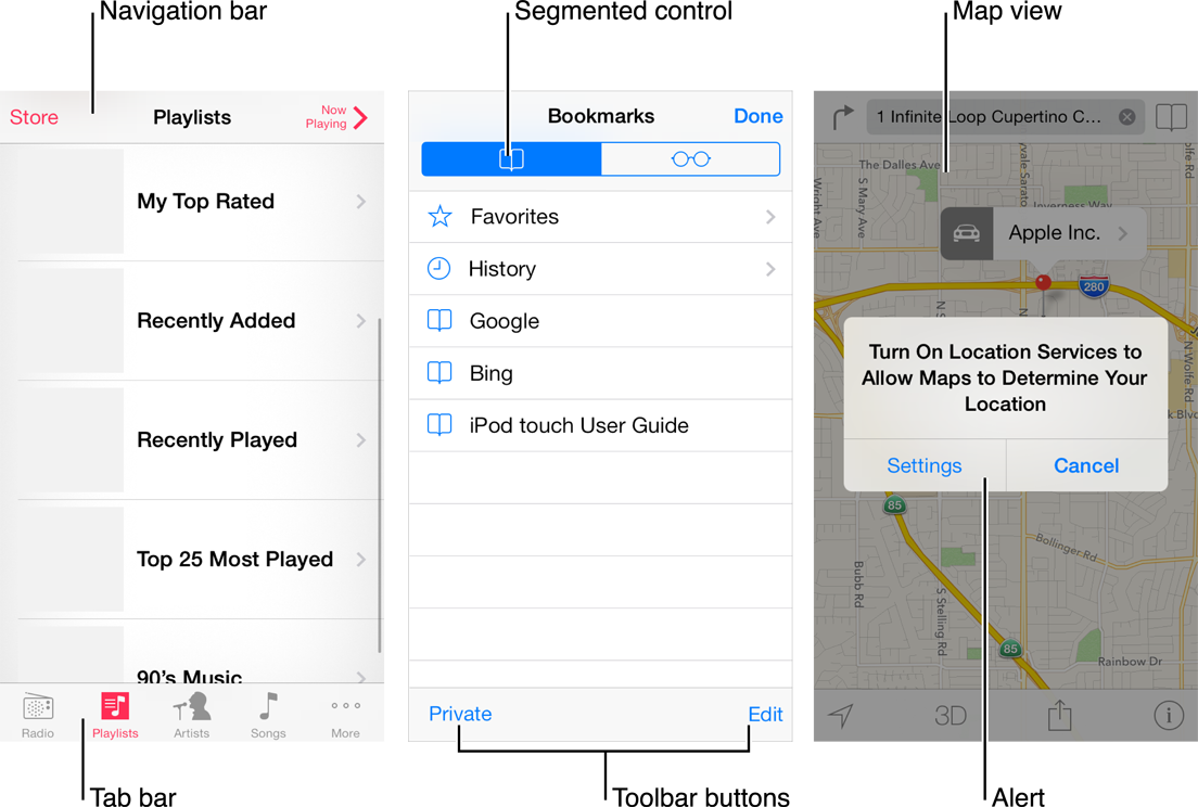
I’ll be referring to this graphic below.
Problems with Borderless Buttons
The Problem
What separates borderless text buttons from plain, non-actionable text?
For example, regarding the “Playlists” view on the left side of the image above, how do I know that “Store” is a button, and “Playlists” is not?
Counter-argument
The navigation buttons within iOS 7 are always a different color than non-button text.
- There is no “standard” color for navigation buttons; this color changes between applications. The user cannot look for a specific color and know that that color will always be a button.
- If an application is colorful, the color variance of buttons may get lost in the overload of color.
- Some header text, like “Playlists” in the above image, has historically performed an action within an application, such as returning to the main screen or toggling a view – how do I know when that is and isn’t the case?
- Theoretically, if an application developer ever makes the header text the same color as the navigation button text, mass confusion will ensue.
Counter-argument
The text itself relays the message “I am a button!” to the user. If a button says “Next Page,” or “Send,” I know it’s a button.
I don’t want to have to read some text to decide whether the text is actually an actionable button or not. I want to quickly look at the screen and understand which elements on the screen are buttons. If I have to spend a few milliseconds reading text to determine how to move within an app, I believe the design has failed.
The Problem
How does the user know where a button’s touch area ends?
Take a look at the bottom of the middle screenshot in the image above. How do I know where the “toolbar buttons” end, and a touch dead-zone begins?
Counter-argument
It is obvious that the buttons end where the text ends.
I would argue that this isn’t obvious. In the “Bookmarks” view above, tapping anywhere in the horizontal area around the word “Google” will take a user to Google, and highlight the entire row. However, tapping 20 pixels to the left of the word “Edit” does not change the view to edit mode, and tapping 20 pixels to the left of “Done” does not take me out of the “Bookmarks” view.
Also, the touch area of the button does extend a few pixels beyond the text in all directions, an attribute that isn’t immediately obvious by looking at the screen.
The Problem
Text buttons in non-standard places are very difficult to find.
Users may come to expect navigation buttons in iOS 7 applications to always be at the top of the application, and toolbar/tab buttons to always be at the bottom of the application. However, as soon as an app developer moves a button to an unexpected place, the user will be forced to scour the screen for buttons. This isn’t a problem specific to iOS 7 – non-standard button placement plagues all applications – but the problem is compounded by the fact that the user can’t look for something that looks like a standard button; the user will have to look for text, and then test the text to see whether or not it is a button.
I Still Like iOS 7
I’m still a big fan of Sir Jony Ive’s radical new direction with iOS 7’s design. I strongly believe that these kinds of huge changes heavily disrupt existing trends, and force designers to rethink their work in a positive manner. That being said, I believe that borderless buttons hinder the total success of iOS 7.
Also, I’m an Android guy, so I don’t have to live with it.
What do you think?
If you’d like to see some other examples of iOS 7’s design missteps, check out sloppyui.